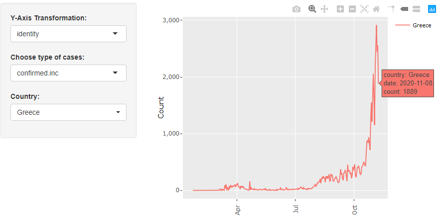
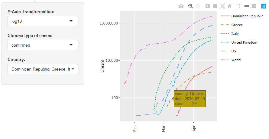
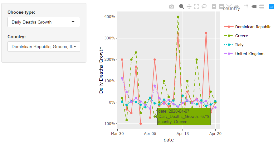
R-Shiny Apps
R-Shiny Apps that I have created for COVID-19 data visualizations. Please wait a few seconds for the graph to be created.
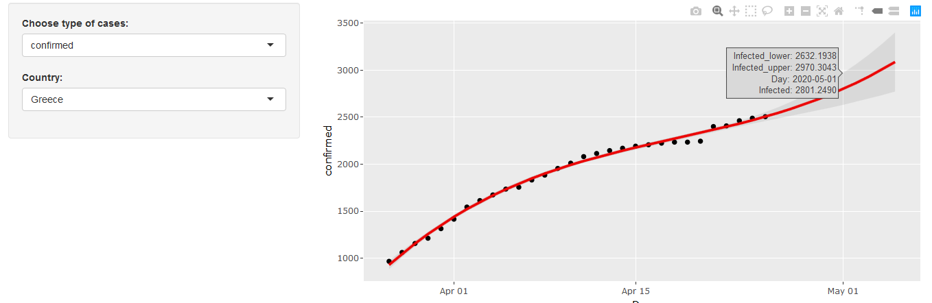
Use dropdown menus on the left for different input selections. Hover over the graphs for more information.
Use the menu on the top right for further options, such as zoom or download.
Data on COVID-19 are provided by
Johns Hopkins CSSE.
The graphs are automatically updated daily and have been created using
Shiny from R-Studio
and
Plotly.
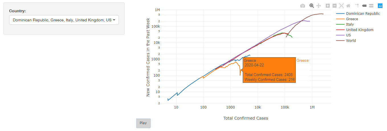
(This interactive charts the new confirmed cases of COVID-19 in the past week vs. the total confirmed cases to date.
When plotted in this way, exponential growth is represented as a straight line that slopes upwards.)
Created By: Dimitris Fouskakis